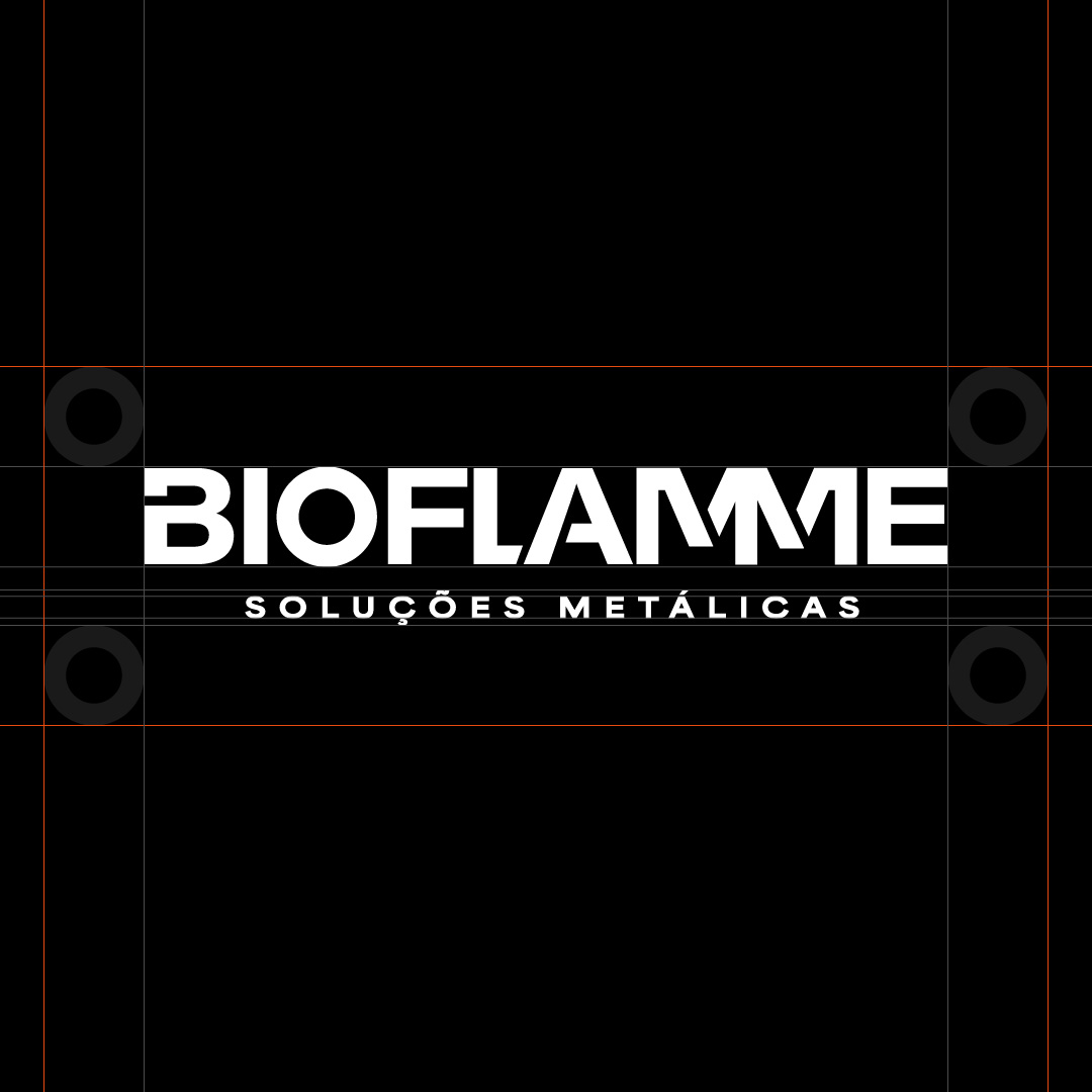

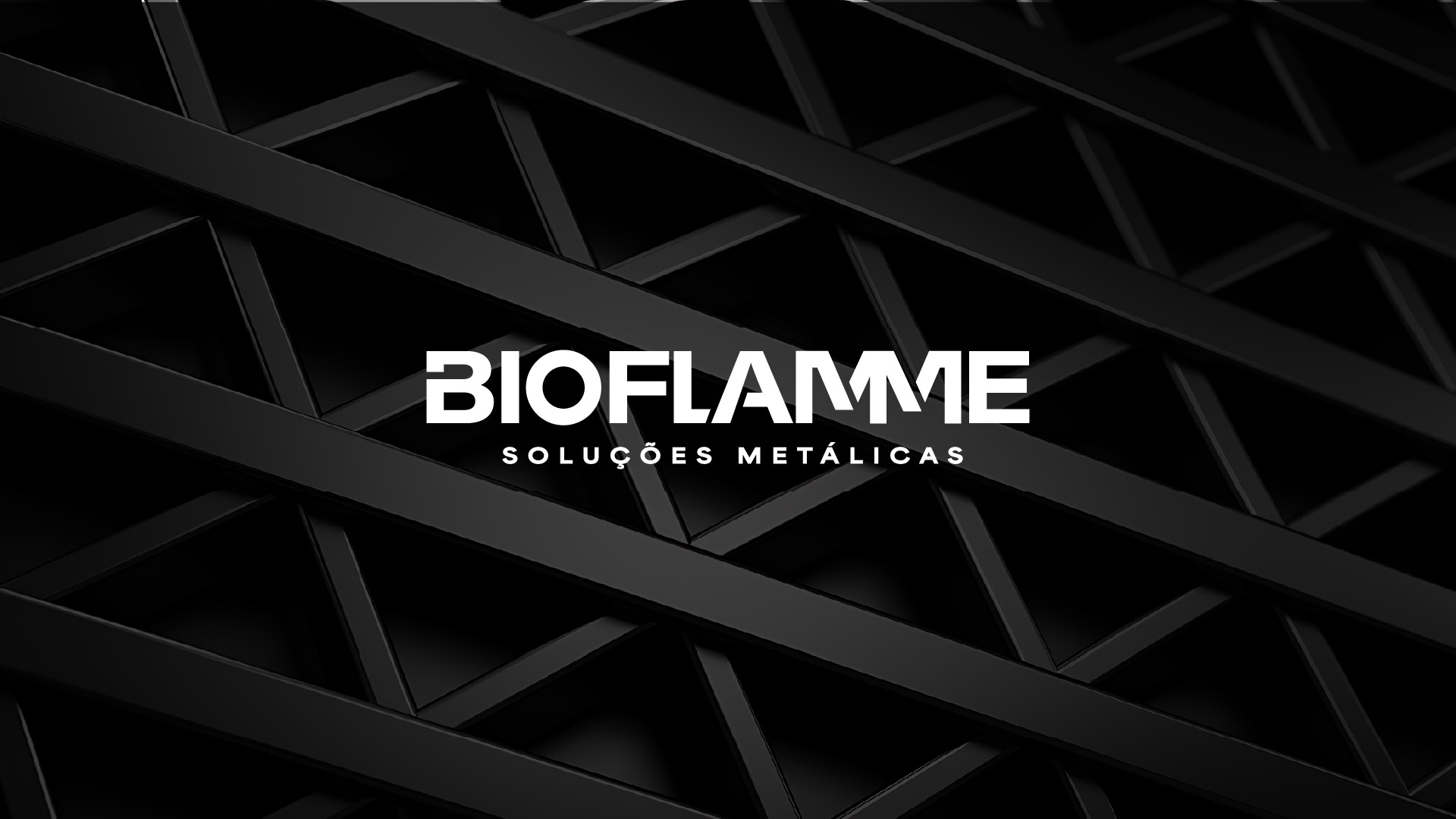
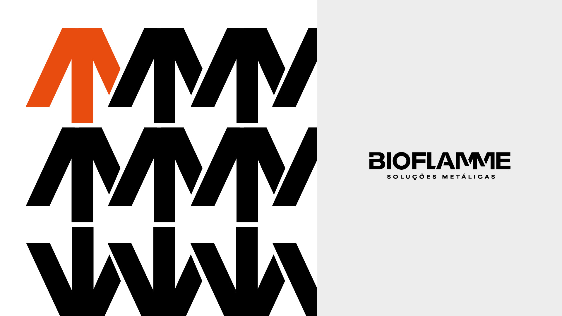
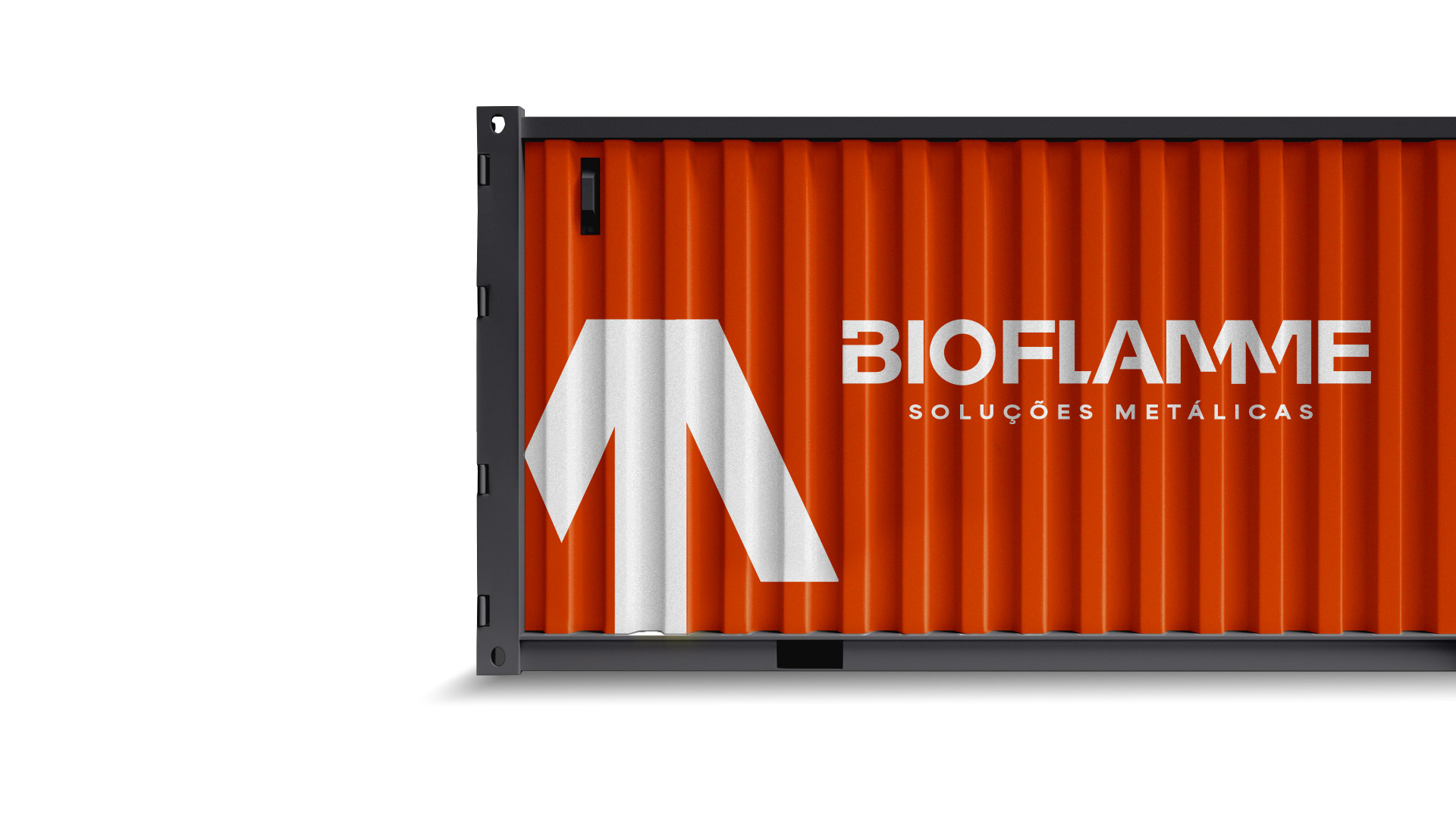
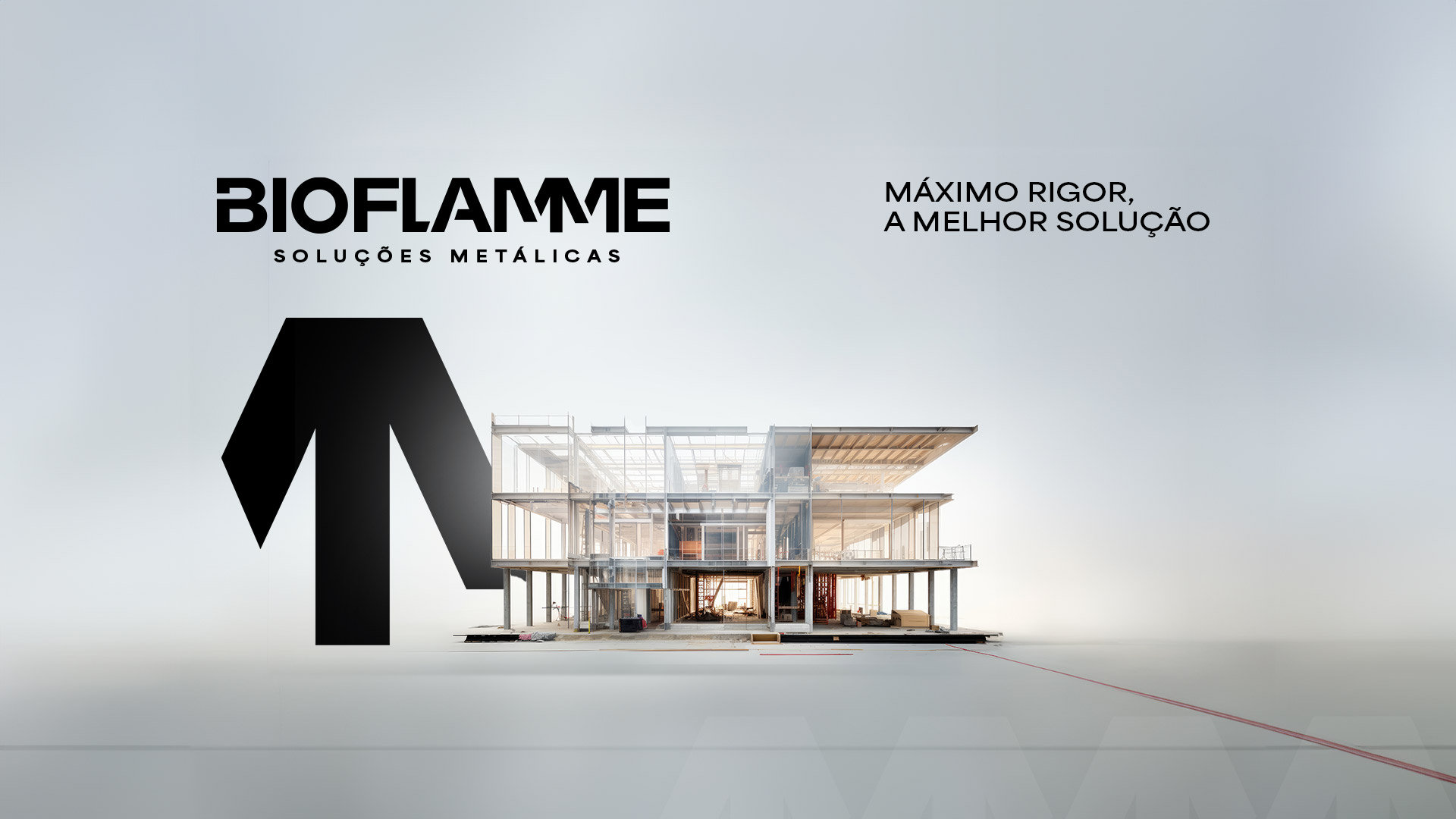
Bioflamme's identity reflects the industrial, bold character of the brand and the sector in which it operates. The lettering conveys a cohesive structure, where the precise fit of the letters forms a solid and striking block. The diagonal cuts create a symbol that sums up the essence of elevation and growth, representing the evolution of the brand, its projects and solutions.


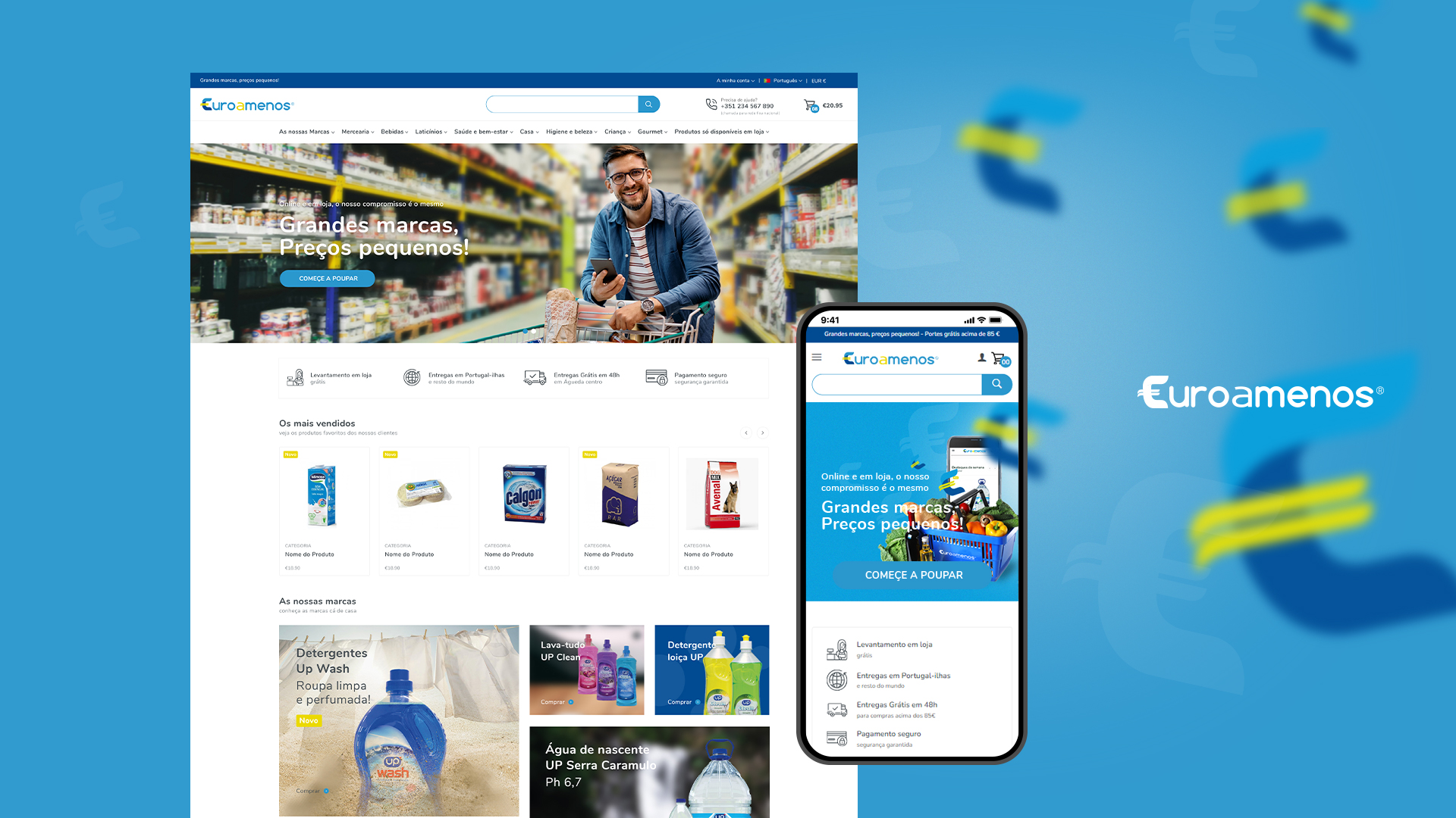
At euroamenos.pt, you'll find "Big brands at small prices." This online store features a wide portfolio of food products and consumer goods. This is a case of respect for the client's communication and positioning, where the project's identity colors have transitioned into the digital world. With a focus on the experience of quick and easy purchasing, the store offers various payment methods.
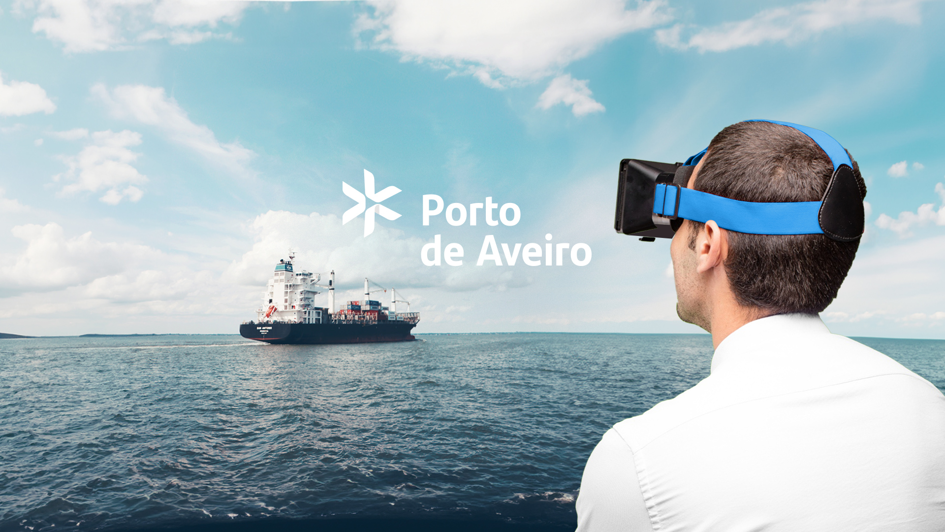
The Port of Aveiro, with its doors open, offers a unique virtual tour filled with amazing 360º perspectives and viewpoints. Put on your VR glasses, follow the map, and explore the port facilities without leaving your seat. Available across various devices at www.portodeaveiro360.pt.