In the past, the first logos emerged with the simple objective of identifying who made the products.
But companies have grown and are today much more complex than just the products they sell.
They are entities that have internationalized, adopted values, develop their own culture, have their own opinions, and above all, tell stories.
The communication of the activity, services, or products that the brand offers is ultimately carried out through advertising language, physical stores, complementary graphics, packaging, digital marketing, and other elements related to the external image. Not necessarily the logo.
That's why logos don't need to merely reflect what brands do or sell, but rather communicate who they are. Designing a logo that literally represents a brand's activity is equivalent to characterizing the gender but not the individual, and there is a lot of competition sharing the same gender:
Automotive Industry;
Wine Industry;
Software;
Mobile Phones;
Retailers.
That's why the entire concept and discourse that supports an identity should refer to values and attributes that represent the brand, such as technology, purity, trust, rigor, tradition. These will always be more abstract than its own activity.
These characteristics will be used by visual solution designers, with the aim of creating a memorable logo that represents the essence of the brand, which certainly goes beyond directly communicating what products the brand sells.
Non-literal logos are more versatile and enduring. They can remain relevant when brands expand their product offerings or aim to target a new market segment.
By symbolically representing an attitude or the essence of the brand through shape, typography, and color, they are not limited to a cliché, generic, and insufficient icon.
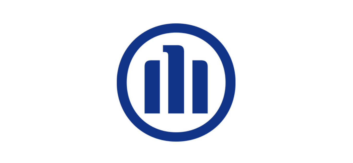
To illustrate this point, we can analyze the logo of the insurance company Allianz. The logo consists of a circle with 3 lines inside representing the brand's 3 business areas:
Insurance;
Asset Management;
Provisions for pensions.

However, none of this is presented in a literal way. We don't see any allusion to legal documents, nor to insurance agents with a folder in hand.
If we look at it as a single form, the 3 lines suggest the silhouette of an eagle, and with that, the symbolic attributes that this animal brings: Honesty, Courage and Strength.
All the elements that make up the logo, in their simplicity and abstraction, exist with a clear intention and give meaning to the form.


The year 2024 is going to be very challenging for brands, social and political events are multiplying and there are so many uncertainties that they are causing some instability in the lives of companies and brands. It's in this climate of uncertainty and challenges that marketing takes on a crucial role in differentiating those seeking consumer attention.


